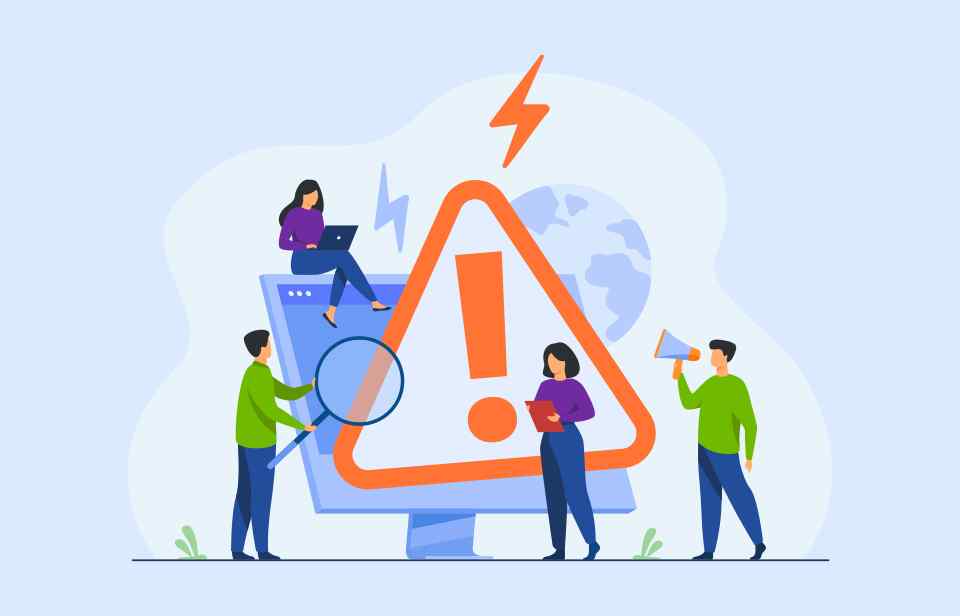
You’ve created an amazing landing page that you designed yourself from scratch. It’s full of brilliant information to attract clients and bring more revenue to your business.
There’s only one problem – you haven’t been getting a lot of conversions with it.
Sure, your visitors are clicking on the page but nobody is converting, why?
This could be down to a few different reasons and today, we’re going to go through the 7 most common mistakes people make on their landing pages and why they could be killing your conversions.
1. Slow loading time
People are impatient. They don’t want to wait forever for a single landing page to load. If they have to wait more than a couple of seconds to get onto your site, they’re probably just going to click away before even seeing what you have to offer.
How you can improve the loading speed of your landing page
1. Reduce HTTP requests
You can reduce the number of HTTP requests by using CSS sprites to reduce the number of image requests. By combining background images into a singular image you can reduce the time it takes for your landing page to load.
2. Reduce the size of your images
Large images can seriously affect your loading speeds, which is why you need to reduce the size of your images.
It isn’t enough to just make them smaller in the HTML as this will only change the appearance of the image but not its actual size. You’ll need to use an external editor to resize your image like Photoshop. Resize all your images to 72dpi and it’ll help improve your landing page’s load speed.
3. Avoid inline JS and CSS files
Placing your website’s JS and CSS in external files will allow your browser to cache the files externally which will reduce the load time of your landing page.
4. Reduce Cookie Size
Cookies are used by websites to store data from your visitors – the more data that is saved the longer your load time is. So, by getting rid of unnecessary cookies you’ll be able to speed up your page’s load time.
If you think there is something else wrong with your page you can use Google’s PageSpeed Insights to check over your page for you.
2. Misleading or uninteresting headlines
Headlines are used to grab the attention of your visitors and if they’re not attention-grabbing, you’re going to lose a lot of potential clients.
What does a good landing page headline include?
Your landing page headline needs to be informative so your visitors know exactly what they’re looking at when they land on your page.
By being informative you’re improving the chances that your lead will follow through and become a paying client. Why? Because your landing page should tell them everything they need to know so they can convert.
If your headline isn’t clear enough your potential client could end up becoming confused. If they’re confused then they might not understand what it is you’re offering and what it is you want them to do on the page.
Your landing page headline should make an impact on your audience. Use this 4 point checklist when writing your headlines to make sure you have everything right:
- Include a benefit: why the visitor needs to keep reading
- Use power words: fast, brilliant, free, final
- Add in some relevant keywords
- Length matters: the shorter the headline the punchier it sounds
3. Unclear calls to action
One of the most important aspects of your landing page is your call to action (CTA). They are the very reason why your landing page exists. Without a clear CTA on your landing page, your audience won’t understand what needs to be done or what they have to do next.
Your CTAs need to be clear, obvious, and easy to understand so your visitors will be able to interact with them without an issue.
Your CTA shouldn’t be hard to find on your landing page, it should be hard to ignore.
How to make a good CTA for your landing page
Try out these four tips when choosing and using your calls to action:
- Use contrasting colours: your CTA should be coloured in contrast with the colour of your landing page. This helps it stand out and makes it easier for your visitors to find it.
- Include action words: your CTA should incorporate words like go, start or try to encourage your visitors to click on it.
- Make the button larger: the button for your CTA needs to be larger than the other elements around it so it can stand out to your visitors.
- Give your CTA a time frame – like now or today.
4. Using multiple calls to action
The main job of your landing page is to make sure your visitors take a single action. You don’t want them getting distracted by multiple options.
It might seem like a good idea to put multiple CTAs on your landing page, but it’ll only distract your visitors and reduce the chances you have of getting them to convert.
Covering your landing page in multiple buttons can work to your advantage but only if these buttons all share the same end goal. Don’t flood your landing page with multiple CTAs that have various different goals on them. This will only cause your users to get confused and you’ll end up losing out on conversions.
A CTA should always have:
- One action
- One goal
Following this, you’ll be able to gain the results you want and receive more conversions on your landing page.
5. No social proof
When you create your landing page you want to include some form of reviews, testimonials, or feedback from previous clients.
Without it, you won’t be able to strengthen your visitor’s faith that you will accomplish what you say you will. This social proof will help give you a stronger reputation and increase your trustworthiness in the eyes of your visitors.
Having social proof on your landing page allows potential clients to feel a lot more comfortable about the idea of working with you. It creates a sense of authenticity and shows how valuable you are as a business – it’s the modern version of word-of-mouth referrals.
6. Labour intensive opt-in forms
How much information do you want to get off your clients and how much is actually necessary?
Your client might get to your landing page, click on your CTA, and get to the point of filling out your form. But, if you start asking for too much information your potential lead might decide to turn and head for the hills.
You can’t ask your potential clients for too much information without first developing a strong, trusting relationship with them. Asking for too much will only raise red flags for them.
To start off, only ask for the information that is absolutely necessary, by asking for anything else you could be overstepping their tolerance for form filling (who enjoys that anyway!).
For example, just ask for their name and email and then, later on, ask for information as it’s needed. You don’t need access to somebody’s home address and phone number if you’re just adding them to an email marketing list.
Want some help making fantastic landing pages that will push traffic into your online store? Get in touch with the team at Ireland Website Design and we can help you out.