Did you ever stop to think that your website visitors, customers, and clients are just as busy as you are? Don’t add to their burden unnecessarily.
In 2016, less is definitely more. We have instant access to information online – and a plethora of information at that. So much so that those browsing for something can come to appreciate a more simple and streamlined approach to the way in which information online is presented to them. Here we show you how to not drown those who use your website with unnecessary information that may be ‘nice’ but not necessary to help the customer or to help you make a sale.
Having an ‘About Us’ section and a bit of background to your business is great. It conveys a genuine human edge as to what spurred and drives your business. However, this should not take front and center on your website; telling your visitors that your first factory was opened in Dublin does not do much to foster a sale. Keep this information tucked away in an ‘About Us’ tab or section for those who want to seek it out.
A professional website designer can help you to declutter your design interface. What does this mean? Well some websites suffer from stuffing their web pages with content, graphics, and features that they think will appeal to their visitors but instead, this overwhelms them and loses them in the process. By removing or scaling down distracting social sliders and video widgets, for example, your pages can become more like landing pages and present a clear user journey to be followed: 1. Arrive on the page, 2: Discover offer, 3: Back-up offer with testimonials, 4: Add to cart, 5: Checkout.
Have you ever been on a website where you found information that you wouldn’t expect to find? Perhaps you are on your local bakery website as you need a birthday cake, but they have a plugin on their website that shows you the weather in your area and also the latest headlines from the news. Useful? Perhaps. Going to help you choose a birthday cake? No. This space would be better utilized with relevant information i.e. “Buy one cake get a one-half price this month only!” Or, in keeping with the above point, have some clear blank space and breathing room on the webpage design.
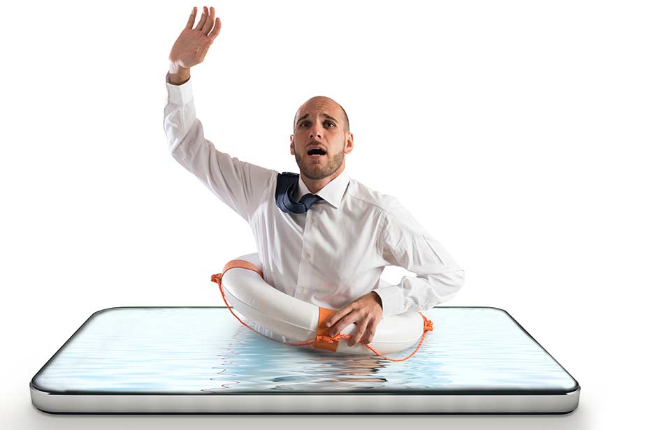
As seen above, by keeping the relevant content in relevant sections, decluttering your layouts, and focusing on what your business does best; you offer a lifeline to potential customers who are drowning in unnecessary information from your competitors. Contact the expert team at Ireland Website Design today to have a streamlined and optimized, responsive website to drive sales to your business.