
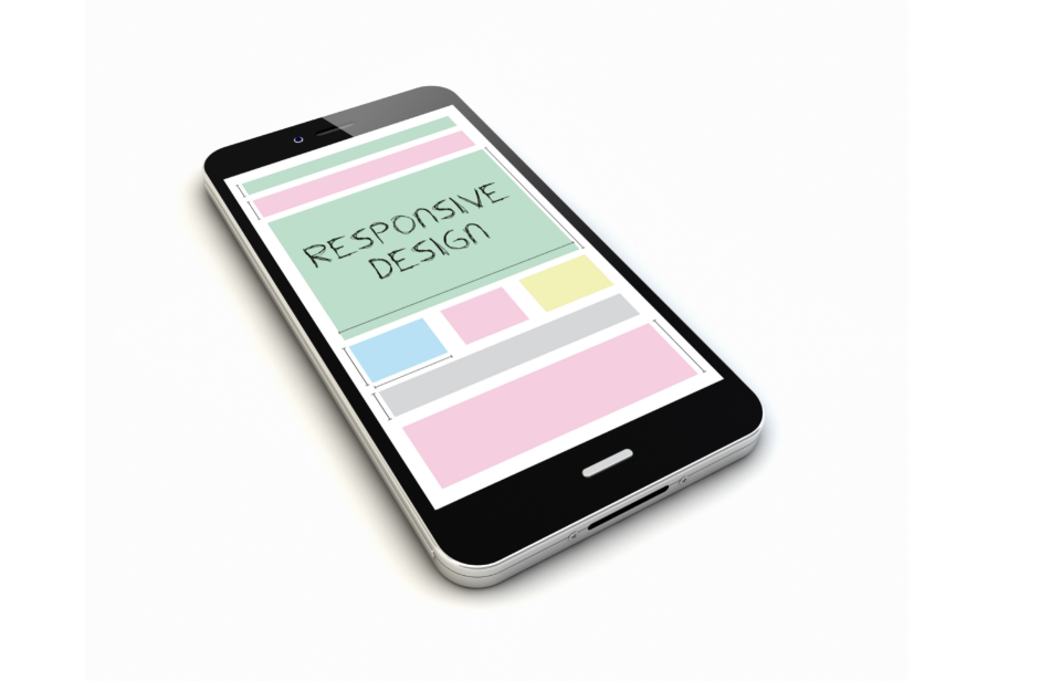
A mobile responsive version of your website is something that you definitely need if you do not have one already. This should mirror your desktop website in terms of style and content, but the main difference is how your information is delivered to and viewed by a browser on a mobile device.
It has been well documented that in recent years people are moving more away from the use of desktops and laptops for their daily internet use and are instead opting to use their mobile devices (mainly phones and tablets) instead. With the advent of wearable technology also, such as Google Glass and the Apple and Samsung Watches, it is clear that the internet will be consumed on portable devices that can be used easily while on the go.
With this, it becomes apparent that your website needs to be reactive, legible and functional for those who may access it on a mobile device – and the likelihood is that a lot of traffic will come to your website via mobile devices. Such is their prevalence, use and expanding reach that Google has even redefined their algorithms to favour websites that are mobile responsive. Being ahead of the curve, Google wants to ensure that they direct browsers to websites and content that will work for them through whatever device they access it on. This means that if your website is mobile responsive, Google will favour it and will not shy away from directing traffic to your website.
In short, a mobile responsive version of your website should mirror your desktop website in terms of style and content, but the main difference is how your information is delivered to and viewed by a browser on a mobile device. One of the biggest differences between using a computer/laptop compared to a mobile device is screen size. What fits well and looks well on a computer screen must adapt to perform just as well on smaller mobile devices. This dictates a redesign of sorts whereby text size, image placement, call-to-action points and more must be plotted out and optimised for use.
Most mobile devices today make use of touch screen technology instead of the more traditional keyboard and mouse. This adds another layer to the mobile responsiveness of your site. You and your website designer will have to decide what parts and areas you want to be touch responsive and what parts and areas you don’t.
You should keep in mind that if your entire mobile website was to be made where every box, tab, menu and picture etc. was a touchable link; this would make the user experience very difficult to navigate. For example, a user may simply want to scroll down a page but upon placing their finger on the screen to do so, they are inadvertently taken to another page as they have unwittingly touched off a link.
Here at Ireland Website Design, we understand the vital need for your website to be mobile responsive and make sure that our designs do this in the best way possible. During the website design process, we make sure to liaise with our client every step of the way and this of course includes the mobile responsiveness aspect of your website. If you run an online shop for example, you may want to emphasise a touch-to-purchase icon on your mobile website and similarly have bigger icons on this mobile website to accentuate this and other specific features.
Get in contact with us about your overall website and mobile website needs – we are here to help.