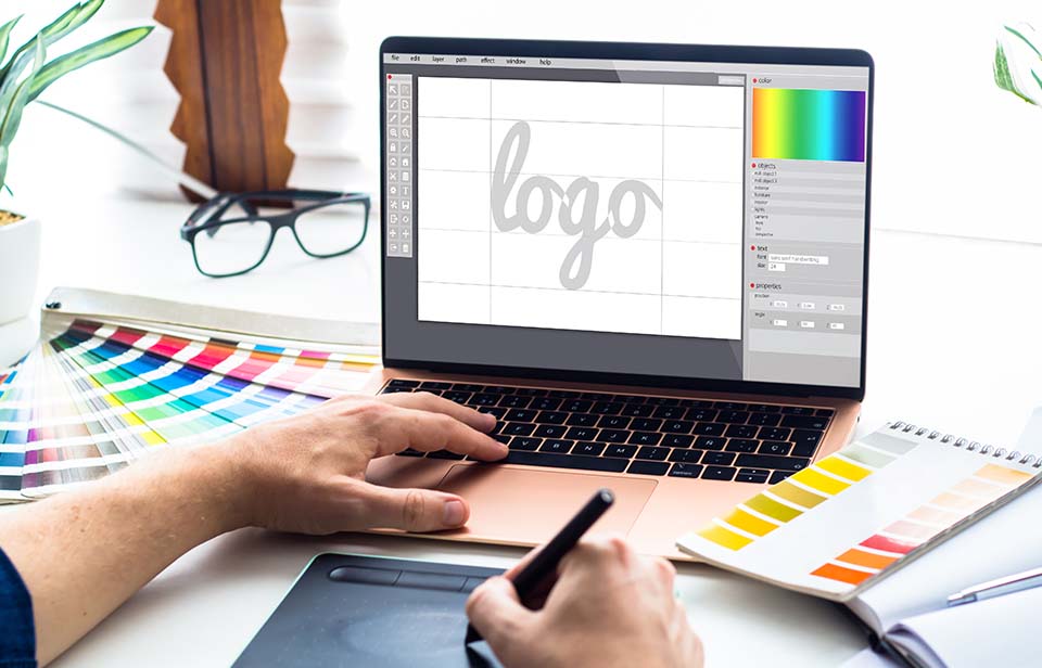
The first impression you make on potential customers is a long-lasting one. Usually, a company’s logo is the first thing a person sees – therefore, make sure it looks good, it looks professional and it also sets you apart from your competitors! Here are our top 6 logo design tips to help you decide on a memorable and stylish logo for your company.
1 – Consider the theme.
What does your company do? Does it sell products or services? If you’re a 5* boutique hotel, don’t settle for a logo that would look good outside a discount store. If your business is more upmarket, keep it classy. If your company revolves around child services/products you want bright, funky colours and a friendly feel. If you look at your logo as if for the first time, can you tell what kind of business you are?
2 – Think outside the box.
We’re talking symbolism here. You don’t need to be completely obvious about your company’s services. Run a bakery? You don’t need to have an image of someone pulling a loaf out of the oven – try cookies or cupcakes instead. Animal-based business? Try a doggy bone or the distinctive outline of a cat! Water and clouds can symbolise anything from spas to yoga to website hosting. Your opportunities are endless, so don’t stick with what you’ve seen before – try something new.
3 – Look into the effects of colour on consumers
It’s well known at this stage that colours heavily influence how people think about things. Before giving the go-ahead to your logo, do a bit of research into the colours you use. For certain industries, there are staple colours that people associate with that area. Think of a recycling company or eco-friendly business – they most likely feature greens and browns throughout their branding. Surf school? You’ll find blue is the most popular colour. Look into some colour psychology studies; what colours invoke trust? What’s considered kid-friendly or adult-only? Once you’ve settled on your choices, ask a few people what first pops into their minds and see if it correlates with what you were aiming for.
4 – Where’s it featured?
If it’s plastered across billboards, you can get away with more complex designs. If it’s going to be on business cards only, stick with something simple that can be easily seen when small. Is it going to be printed on flyers? You’ll need it to stand out from the crowd. If you rely heavily on traditional newspaper advertising, you don’t want something that will look blurry when the ink runs together.
5 – Will it stand the test of time?
Yes, you need to be up-to-date and modern, but avoid sticking to fancy trends too much. Trends come and go. A lot. Will your logo still look good in 3 years’ time? If it doesn’t, you’ll need to completely re-brand everything or you’ll look outdated. Best choose a stylish logo now and avoid any fads that will be out of fashion in 6 months’ time.
6 – Keep it simple.
We really cannot stress this one enough! A logo should be simple and easy to recognise. You may not be a big brand (yet!) but you should think like one when it comes to your logo. Think of 5 famous logos right now. We’re betting Apple, McDonald’s, Google, Twitter and Nike are all somewhere in most people’s lists. Why? Simple and memorable. You want your customers to remember you over your competitors – a simple, stylish logo is the first step in ensuring they do.


